 Utilify Zone
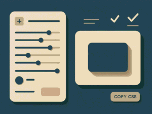
Css Box Shadow Generator
Shadow Layers
Box Properties
Export Code
What Does a CSS Box Shadow Generator Do?
A CSS box shadow generator helps you visually create shadow effects for HTML elements and instantly outputs optimized CSS code. Instead of guessing values like blur, spread, or opacity, you can adjust sliders and see changes in real time. This is especially useful for creating card shadows, button effects, neumorphic UI, and modern layouts without writing CSS manually.
Free CSS Box Shadow Generator for Modern Web Design
Creating clean and realistic shadows is a key part of modern UI design, but writing box-shadow values by hand often leads to trial and error. With a free CSS box shadow generator, designers and developers can build shadows visually and export production-ready CSS in seconds. This tool allows you to control X and Y offset, blur radius, spread, opacity, and color while previewing results instantly.
For example, if you’re designing a pricing card for a SaaS landing page, you can create a soft shadow that subtly lifts the card off the background. For ecommerce product images, deeper shadows can help items stand out and increase click-through rates. Because the preview updates live, you know exactly how the shadow will look before adding it to your website. This makes the tool ideal for US-based agencies, freelancers, and product designers who value speed and accuracy.
Use Cases: Where a CSS Box Shadow Generator Is Used in Real Projects
A CSS box shadow generator is not just a design helper — it plays a critical role across modern web development workflows. Designers, developers, and marketing teams rely on shadow generators to create depth, hierarchy, and visual clarity without slowing production.
UI Cards & Containers
Product cards, pricing tables, and feature blocks often need subtle elevation. Using a live preview shadow generator helps designers fine-tune softness and spread so cards feel clickable without being distracting.
Buttons & Interactive Elements
Hover states, call-to-action buttons, and form elements benefit from inset and layered shadows. This improves perceived affordance and user interaction, especially in SaaS dashboards.
SaaS Dashboards & Admin Panels
Complex interfaces require consistent depth. Developers use shadow generators to maintain design system consistency across widgets, tables, and panels.
E-commerce Product Displays
Shadows help products stand out against neutral backgrounds, increasing visual focus and improving conversion rates.
Neumorphic & Modern UI Experiments
Soft UI and neumorphism rely heavily on precise shadow layering. Generators make testing these styles fast and reversible.
Rapid Prototyping & Client Demos
Instead of writing CSS manually, teams generate shadows instantly, speeding up approvals and iterations.
CSS Box Shadow Generator for UI Cards, Buttons, and Modern Layouts
Designing modern layouts often requires shadows that feel intentional, not accidental. A CSS box shadow generator for UI cards and buttons allows designers to visually craft depth that aligns with current design trends while remaining performance-friendly.
For example, when building a SaaS landing page, UI cards need gentle elevation to separate content sections without overwhelming the layout. By adjusting blur radius and opacity in real time, designers can create shadows that enhance hierarchy and readability. Buttons benefit even more — subtle shadows help guide user attention and improve click behavior.
This approach is especially valuable for US-based agencies and product teams working on high-traffic websites. Instead of relying on prewritten snippets, they can generate optimized CSS shadows tailored to each component. Because the preview updates instantly, teams avoid guesswork and reduce redesign cycles. The result is cleaner layouts, faster development, and more polished interfaces — all without writing box-shadow values manually.
Build Advanced UI Shadows Without Writing CSS Code
This online CSS shadow generator is built for both beginners and professionals who want advanced results without complex coding. You can stack multiple shadow layers to create realistic depth, enable inset shadows for pressed-button effects, or fine-tune RGBA opacity for dark mode interfaces. These features are essential for trending design styles like neumorphism, soft UI, and material-inspired layouts.
Imagine designing a dashboard widget for a fintech app targeting US and UK users. By combining two shadow layers—one soft and one sharp—you can create a premium, high-trust look that improves user engagement. The tool also lets you test shadows against different background colors and border radii, ensuring consistency across devices. Once finished, simply copy the CSS or export structured data for reuse. This workflow saves time and supports scalable design systems used by high-CPM markets.
How to Use the CSS Box Shadow Generator – Create Custom Shadows Online
Looking to add depth, realism, or trendy effects to your web design? Our CSS Box Shadow Generator is the perfect tool for developers and designers who want to create custom shadows online with live preview. Whether you’re experimenting with neumorphism, glassmorphism, or simply need a quick box-shadow CSS snippet, this guide will show you exactly how to use the tool step by step.
Step 1: Access the Tool
Navigate to the CSS Box Shadow Generator page. The interface is split into two sections:
- Controls Panel (left side) – where you adjust shadow properties.
- Live Preview Box (right side) – instantly shows how your shadow looks.
Step 2: Adjust Shadow Layers
- Click “Add Layer” to stack multiple shadows.
- Use sliders to control horizontal offset, vertical offset, blur radius, and spread radius.
- Toggle Inset to create inner shadows.
Step 3: Customize Colors
- Pick a shadow color using the color picker.
- Adjust opacity with RGBA values for subtle or bold effects.
- Combine gradients with shadows for modern UI styles.
Step 4: Modify Box Properties
- Change width and height of the preview box.
- Adjust border-radius for rounded corners.
- Select a background color to test shadows against different surfaces.
Step 5: Apply Preset Shadows
Choose from ready-made presets like:
- Soft – subtle blur for minimal designs.
- Layered – stacked shadows for depth.
- Elevated – card-style shadows.
- Deep – dramatic drop shadows.
- Solid – bold, offset shadows.
Step 6: Export CSS or JSON
- Click Copy CSS to paste directly into your project.
- Export JSON shadow data for advanced workflows or saving presets.
Why Use This Tool?
- Fast & Free: Generate shadows online without coding from scratch.
- Live Preview: See changes instantly.
- Modern Design Ready: Supports neumorphism, glassmorphism, and layered shadows.
- Developer-Friendly: Copy-paste CSS code or export JSON.
FAQs
Is this CSS box shadow generator free for commercial use?
Yes. You can generate and use the CSS shadows for personal and commercial projects without restrictions.
Can I use this tool for responsive web design?
Absolutely. The generated CSS works across all screen sizes and modern browsers.
Does it support multiple box shadows in one element?
Yes, you can add multiple layers to create advanced and realistic shadow effects.
Is this tool useful for UI/UX designers?
Very much so. It’s ideal for prototyping, design systems, and production-ready UI components.
Do I need to install anything to use it?
No installation required. The tool runs directly in your browser.
Conclusion
The CSS Box Shadow Generator is more than just a utility — it’s a design companion for developers, UI/UX designers, and beginners. By combining multiple shadow layers, inset options, presets, and live preview, you can create stunning effects in seconds.
Start experimenting today and make your web elements stand out with custom CSS shadows.
visit our site for more tools: https: utilifyzone.com
visit our blog for more details: