Accessible Color Palette Generator
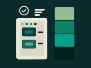
Generated Palette
Color Details
Free Accessible Color Palette Generator – WCAG Contrast Tool for Inclusive Design
Creating digital experiences that everyone can use is no longer optional. Accessibility has become a legal, ethical, and performance requirement—especially in high-traffic markets like the United States, Canada, and Europe. An Accessible Color Palette Generator plays a crucial role in this shift by helping designers, developers, and marketers create color combinations that are readable, compliant, and inclusive.
This guide explains what an accessible color palette generator is, why WCAG contrast matters, and how to use the UtilifyZone Accessible Color Palette Generator effectively to improve usability, SEO, and conversions.
Why Color Accessibility Is a Real User Problem
Many websites fail not because of poor content, but because users cannot read or interact with them comfortably. Low contrast text, poorly chosen background colors, and inaccessible UI elements create real pain points for users with visual impairments, color blindness, or aging eyesight.
In the US alone, millions of users rely on accessible color contrast to navigate websites, mobile apps, dashboards, and digital ads. When contrast ratios fail WCAG guidelines, users struggle to read text, miss call-to-action buttons, and abandon pages early. This directly impacts bounce rate, time on page, conversions, and brand trust.
An accessible color palette generator solves this problem by ensuring that foreground and background color combinations meet WCAG contrast standards, allowing content to remain readable across devices, lighting conditions, and accessibility needs.
What Is an Accessible Color Palette Generator?
An Accessible Color Palette Generator is a tool that helps users create color combinations that meet accessibility standards such as WCAG 2.1 contrast ratios. These tools analyze text and background colors to ensure they meet minimum contrast thresholds (4.5:1 for normal text and 3:1 for large text).
Unlike basic color pickers, an accessible color palette generator focuses on usability, not just aesthetics. It supports inclusive design by identifying color combinations that work for users with color vision deficiencies and low vision.
The UtilifyZone Accessible Color Palette Generator simplifies this process by allowing users to generate, test, and validate accessible palettes instantly—without needing advanced design or accessibility knowledge.
How WCAG Contrast Standards Affect Design and SEO
WCAG (Web Content Accessibility Guidelines) are widely adopted accessibility standards that influence both usability and search visibility. Google increasingly rewards accessible websites because they provide better user experiences.
Poor contrast can harm:
- Readability and comprehension
- Engagement metrics
- Mobile usability scores
- SEO performance
- Legal compliance in regulated industries
Using a WCAG contrast tool helps designers and marketers ensure that color choices meet accessibility benchmarks while improving page experience signals used by search engines.
Accessible color palettes also support dark mode accessibility, responsive design, and cross-device consistency—key factors in modern UI/UX.
How to Use the UtilifyZone Accessible Color Palette Generator (Step by Step)
The UtilifyZone Accessible Color Palette Generator is designed for simplicity and speed. It works directly in the browser and requires no installation.
Step 1: Open the Tool
Visit the tool page:
https://utilifyzone.com/accessible-color-palette-generator/
The interface allows users to select or input colors for text and backgrounds.
Step 2: Choose Base Colors
Users can start with brand colors or experiment with new combinations. This is especially useful for designers working on branding, landing pages, dashboards, or marketing creatives.
Step 3: Check Contrast Ratios Automatically
The tool instantly evaluates the contrast ratio between selected colors and highlights whether they pass WCAG standards. This removes guesswork and saves time compared to manual testing.
Step 4: Adjust Colors for Compliance
If a combination fails accessibility checks, users can tweak brightness, saturation, or hue until the palette becomes compliant—without sacrificing visual identity.
Step 5: Apply Across Projects
Once validated, accessible color palettes can be used across websites, apps, presentations, dashboards, and ad creatives.
Designing for Color Blindness and Visual Impairments
One of the most overlooked aspects of design is color blindness accessibility. Many users cannot distinguish between red and green or blue and yellow combinations. Relying solely on color to convey information creates usability barriers.
An accessible color palette generator helps avoid these issues by encouraging contrast-based design rather than color-dependent signals. This is especially important for:
- Charts and graphs
- Dashboards and analytics tools
- Forms and error messages
- Call-to-action buttons
By using accessible palettes, designers ensure information remains clear even when color perception varies.
Accessible Color Palettes for Dark Mode and Modern UI
Dark mode is now a standard feature across apps, operating systems, and websites. However, many dark mode designs fail accessibility standards due to insufficient contrast.
Accessible color palette generators help create WCAG-compliant dark mode palettes that balance comfort and readability. This is critical for:
- SaaS platforms
- Developer dashboards
- Mobile apps
- Content-heavy websites
Dark backgrounds require careful contrast adjustments to prevent eye strain while maintaining brand consistency. Using a WCAG contrast tool ensures dark mode designs remain usable and inclusive.
Accessibility in Marketing, Ads, and Conversion Optimization
Accessible design directly affects marketing performance. Poor color contrast can reduce CTA visibility, lower click-through rates, and increase bounce rates—especially on mobile devices.
Marketers benefit from accessible color palettes in:
- Landing pages
- Email campaigns
- Social media ads
- Display banners
- Infographics
Accessible CTAs are easier to spot, read, and interact with, leading to higher engagement and conversions. This makes accessibility not just a compliance requirement, but a conversion optimization strategy.
Using Accessible Palettes with Other UtilifyZone Tools
For even better results, accessible color palettes can be combined with other tools on UtilifyZone:
- Best CSS Gradient Generator – Create visually rich gradients while maintaining accessibility balance
- CSS Box Shadow Generator – Improve depth and hierarchy without relying only on color
- Real-time QR Code Generator – Pair accessible colors with scannable QR designs for marketing materials
Together, these tools help create visually appealing yet inclusive digital assets.
Accessibility as a Long-Term Business and SEO Advantage
Accessible design is not a trend—it’s a long-term investment. Businesses that adopt accessibility early reduce redesign costs, legal risks, and usability complaints.
From an SEO perspective, accessibility improves:
- Page experience
- Mobile usability
- Engagement metrics
- User satisfaction
Search engines increasingly favor sites that are usable by everyone. An accessible color palette generator supports this goal by making accessibility practical and scalable.
When to Use an Accessible Color Palette Generator Beyond Websites
Accessible color palettes are not limited to websites. They are equally valuable for:
- Mobile apps
- SaaS platforms
- E-learning tools
- Healthcare and fintech applications
- Presentations and reports
Any digital interface that communicates information visually benefits from accessible color choices.
Final Thoughts: Accessibility Starts with Color
Accessibility does not require sacrificing creativity. With the right tools, inclusive design becomes easier, faster, and more effective. The UtilifyZone Accessible Color Palette Generator empowers users to create color systems that work for everyone—without complex rules or manual testing.
By using an accessible color palette generator early in the design process, teams can avoid usability issues, improve SEO performance, and build digital experiences that feel professional, ethical, and user-first.
Start creating accessible color palettes today:
https://utilifyzone.com/accessible-color-palette-generator/
blog link:
https://utilifyzone.com/accessible-color-palette-generator-wcag-contrast-tool-for-inclusive-design/