 Utilify Zone
This article explains the root causes of iPhone 16 web design issues and provides practical CSS, layout, and responsive design fixes that help developers optimize websites for Safari compatibility, viewport changes, and mobile-first performance.
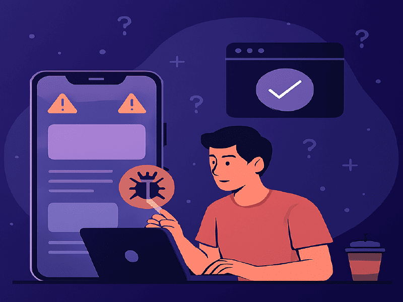
Developers testing layouts on the latest device often discover that the iPhone 16 Pro viewport resolution behaves differently than expected, especially when combined with updated Safari rendering rules. Subtle spacing miscalculations can trigger horizontal scroll, clipped headers near the Dynamic Island, or unexpected zoom on form inputs. These visual issues not only frustrate users but also affect performance signals like Cumulative Layout Shift iPhone 16 Safari, which directly impacts mobile search visibility. To avoid these problems, designers should validate breakpoints around 430px widths, apply safe-area spacing carefully, and test layouts in real-time before deployment. A structured testing workflow ensures cleaner CSS, stable UI behavior, and a smoother mobile experience.
| iPhone 16 Model | Logical Resolution | CSS Pixel Width |
| iPhone 16 | 393 x 852 px | 393px |
| iPhone 16 Pro | 402 x 874 px | 402px |
| iPhone 16 Plus | 430 x 932 px | 430px |
| iPhone 16 Pro Max | 440 x 956 px | 440px |
What Causes iPhone 16 Web Design Issues?
iPhone 16 web design issues are primarily caused by updated viewport width behavior, Safari rendering changes, improper safe-area spacing, outdated media queries, and fixed-width containers that do not align with modern 430px mobile breakpoints.
Now let’s break that down.
1️ Viewport Width Changes
The iPhone 16 Pro operates close to the 430px width range. Many developers still design for:
- 375px (older iPhones)
- 390px (iPhone 12/13)
- 414px (Plus models)
This mismatch creates layout compression and overflow.
2️ Safe Area & Dynamic Island Spacing
Headers and hero sections often ignore safe-area insets. This causes:
- Clipped navigation
- Overlapping sticky headers
- Content hidden behind system UI
This ensures content respects the device boundary.
3️ Safari Rendering Differences
Safari interprets flexbox, overflow, and positioning slightly differently from Chrome.
Common issues:
- Flex children exceeding width
- Absolute elements misaligned
- Font scaling inconsistencies
These issues are more visible on real devices than desktop browser previews.
Why iPhone 16 Web Design Issues Happen — and How to Fix Them Fast
Many iPhone 16 web design issues happen because developers rely on older device breakpoints and assume viewport behavior hasn’t changed. However, the iPhone 16 introduces subtle adjustments in screen dimensions and safe-area spacing that can break headers, sticky navigation, or hero sections. One common problem is Dynamic Island CSS clipping, where top-aligned elements overlap or get hidden due to improper safe-area handling. Applying a proper CSS env(safe-area-inset-top) fix ensures content respects system UI boundaries and remains visible across orientations.
Another reason issues occur is that layouts are not tested at realistic widths. The iPhone 16 operates close to 430px width ranges, so ignoring precise breakpoints leads to cramped designs or overflow errors. Fast fixes include auditing media queries, removing fixed pixel widths, and validating components on real device simulations. When developers proactively test and adjust safe-area spacing, they can quickly stabilize layouts and deliver smooth, responsive performance without redesigning the entire interface.
Developers are reporting:
- Horizontal overflow on iOS
- Sticky headers shifting
- Layout jump during load
- Form zoom on input focus
- Broken grid alignment
Most of these stem from outdated responsive assumptions.
Fix #1: Target the Correct Breakpoint
Instead of generic breakpoints, adjust around 430px:
Fix #2: Prevent Input Auto-Zoom in Safari
Safari zooms input fields if font size is under 16px.
Fix #3: Eliminate Horizontal Overflow
Overflow often comes from:
- Fixed-width elements
- 100vw misuse
- Images without max-width
How to Fix Website on iPhone 16 Pro: Layout, CSS & Responsive Quick Fixes
F Fix website on iPhone 16 Pro issues by starting with a structured layout audit rather than random CSS edits. Many display problems come from outdated breakpoints, rigid containers, or forms that behave differently on iOS. Since the device operates close to Web design for 430px width mobile, developers should fine-tune media queries around that range instead of relying only on generic 375px or 768px standards. Small spacing adjustments can prevent cramped layouts and broken navigation.
Forms are another common trouble area. Applying an Input auto-zoom Safari fix helps prevent unexpected zooming when users tap on text fields. This typically involves setting font sizes to at least 16px and reviewing viewport meta settings. To validate changes instantly, developers can use the UtilifyZone Responsive Breakpoint Tester:
https://utilifyzone.com/responsive-breakpoint-tester/
It works as a fast simulation environment to preview layouts at custom widths before deployment. By refining breakpoints, cleaning up CSS structure, and testing form behavior carefully, teams can deliver a smooth, stable experience optimized specifically for iPhone 16 Pro users.
Comparison: UtilifyZone vs Other Responsive Testing Tools
| Feature | UtilifyZone | BrowserStack | Chrome DevTools |
| No Signup | Yes | No | Yes |
| Real Device Cloud | No | Yes | No |
| Instant Breakpoint Testing | Yes | Slower | Limited |
| Free Access | 100% | Paid | Free |
| Focused on Layout Debugging | Yes | General | Developer-heavy |
UtilifyZone is ideal for:
- Quick breakpoint validation
- Layout debugging
- Mobile overflow checks
- Fast UI testing
BrowserStack is better for deep device-specific QA testing.
Safari Rendering Bugs iPhone 16: Causes, CSS Fixes & Debugging Tips
Safari rendering bugs iPhone 16 have become a common frustration for developers testing modern layouts. Even well-structured websites can display spacing inconsistencies, flexbox misalignment, or unexpected font scaling in Mobile Safari. These issues often occur because Safari’s rendering engine interprets certain CSS properties differently, especially when combined with newer viewport behaviors and device-specific scaling rules. Small differences in overflow handling or position stacking can create visual glitches that are not visible in desktop browsers.
To fix these problems, developers should start by isolating affected components and reviewing flex, grid, and absolute positioning rules. Testing at real device widths helps uncover hidden layout shifts. Using a Responsive tester for iPhone 16 allows quick validation of breakpoints without needing physical hardware. For teams seeking a lighter BrowserStack alternative for iPhone 16, this approach offers fast debugging without complex setup. Clear testing, structured CSS, and consistent validation ensure stable rendering across Safari on iPhone 16.
Frequently Asked Questions
Why does my website break only on iPhone 16?
Because iPhone 16 viewport width and Safari rendering differ slightly from older models, exposing breakpoint and spacing weaknesses.
What is the iPhone 16 Pro viewport width?
It operates close to 430px width in portrait mode, requiring updated media queries.
How do I fix layout shift in Safari on iPhone 16?
Adjust breakpoints, eliminate fixed-width containers, apply safe-area insets, and prevent font scaling issues.
How do I stop input zoom on iPhone Safari?
Set input font-size to 16px or higher and ensure proper viewport meta configuration.
What is the fastest way to test website responsiveness for iPhone 16?
Use a dedicated responsive breakpoint tester that allows custom width simulation without login.
Final Thoughts
iPhone 16 web design issues are not random bugs — they are signals that modern mobile layouts require updated responsive strategies. By:
- Targeting 430px breakpoints
- Applying safe-area inset fixes
- Preventing overflow
- Stabilizing layout shifts
- Testing layouts properly
You can ensure your website performs smoothly across Safari and meets mobile-first SEO standards.
Developers who proactively fix these issues improve:
- User experience
- Conversion rates
- Core Web Vitals
- Search rankings
And with proper breakpoint testing tools, debugging becomes significantly faster and more predictable.
Use the Tool to get Responsive website:
https://utilifyzone.com/responsive-breakpoint-tester/


