 Utilify Zone

By breaking down WCAG 2.2 and Section 508 requirements, this guide shows how an ADA compliant color palette reduces accessibility barriers, prevents costly redesigns, and enables inclusive, sustainable design systems that work for users with low vision and color blindness.
Designing accessible interfaces is no longer optional in 2026. An ADA compliant color palette
2026 is now a core requirement for websites, applications, and digital products that serve the public. As accessibility enforcement increases and WCAG 2.2 becomes the reference standard, color choices directly affect legal compliance, usability, and user trust. This guide explains how accessible color systems work, why contrast matters, and how teams can meet modern accessibility expectations without sacrificing design quality.
This resource is written for designers, developers, product managers, and compliance teams who want a practical, learner-friendly explanation backed by real-world use cases. Throughout the guide, readers are shown how to apply accessibility rules using modern tools rather than relying on guesswork.
What Is an ADA Compliant Color Palette?
An ADA compliant color palette is a structured set of colors designed to meet accessibility laws and technical standards so that content remains readable for all users, including people with visual impairments. In 2026, compliance expectations are more clearly aligned with WCAG 2.2 and US accessibility regulations, making color contrast a measurable requirement rather than a design preference.
Unlike traditional palettes that focus only on aesthetics, an accessible palette considers contrast ratios, color perception differences, and usability across devices. This ensures that text, UI components, and interactive elements remain distinguishable in real-world conditions such as bright light, dark mode, or low-quality screens. The goal is not only legal protection but also improved user experience for everyone.
ADA, WCAG 2.2, and Section 508 Explained (Without Legal Jargon)
The Americans with Disabilities Act applies to digital products through ADA Title II (public entities) and ADA Title III (public accommodations). Courts increasingly rely on WCAG Success Criteria 1.4.3 to evaluate color contrast compliance. For US federal websites and vendors, Section 508 requirements mandate accessible foreground and background contrast.
Together, these standards define ADA website color standards 2026, ensuring text readability, clear UI states, and inclusive digital access. Rather than memorizing regulations, teams should apply these principles through tested tools and measurable contrast ratios.
Who Needs ADA Compliant Color Palettes?
Accessible color systems are critical for SaaS platforms, startups, government portals, education platforms, ecommerce sites, and fintech applications. Any interface that displays text, charts, or interactive elements must support low vision users and color blind accessibility, including Protanopia safe and Deuteranopia friendly combinations.
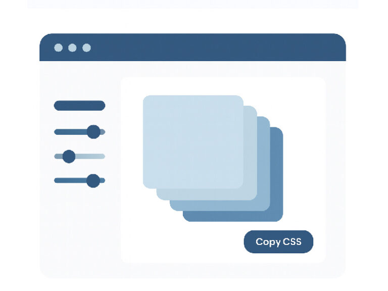
Check your colors instantly with our ADA Compliant Color Palette Generator (Free, No Login)
https://utilifyzone.com/accessible-color-palette-generator/
WCAG 2.2 Color Contrast Requirements You Must Follow
WCAG 2.2 introduces clearer expectations for contrast consistency across devices, themes, and interaction states. At its core, color contrast measures how easily text and UI elements can be distinguished from their backgrounds using a numeric ratio.
A proper WCAG 2.2 color contrast checker calculates contrast using luminosity formulas rather than visual guesswork. These measurements help teams validate accessibility objectively and repeatedly throughout development.
AA vs AAA Contrast Ratios (4.5:1 vs 7:1)
Level AA requires a contrast ratio 4.5:1 for normal text and a 3:1 ratio for large-scale text. Level AAA increases the requirement to 7:1 for body text. For most commercial websites, Level AA is legally sufficient, while Level AAA is recommended for accessibility-first products, healthcare platforms, and government services.
This AA vs AAA contrast ratio guide helps teams decide where stricter standards improve usability without unnecessary redesign.
Common Color Contrast Mistakes Designers Still Make
Frequent issues include light gray text on white backgrounds, accent colors that fail contrast checks, and dark mode designs that rely on pure black. These errors often go unnoticed without a contrast ratio checker for developers.
CTA:
Test AA & AAA contrast ratios live using UtilifyZone’s WCAG 2.2 Color Checker
https://utilifyzone.com/accessible-color-palette-generator/
How to Build an ADA Compliant Color Palette Step by Step
Building accessibility into color systems starts with structure. A compliant palette defines relationships between colors rather than isolated swatches. This approach ensures consistent contrast across components, layouts, and screen sizes.
Choosing Accessible Color Combinations (Hex, RGB & Luminosity)
Accessible combinations are calculated using Hex codes, RGB values, and relative Luminosity. Designers must evaluate Foreground vs Background contrast to ensure readable text and interactive clarity. Safe color spacing avoids subtle tone differences that fail accessibility checks.
Accessible Color Palettes for UI, Charts & Dashboards
An accessible color palette for data visualization and charts ensures users can interpret graphs, infographics, and dashboard contrast accurately. This is especially important in analytics-heavy SaaS tools and financial reporting platforms.
CTA:
Generate accessible palettes for UI, charts, and dashboards in seconds
https://utilifyzone.com/accessible-color-palette-generator/
Dark Mode Accessibility in ADA Compliant Design
Dark mode is now standard across platforms, but it introduces unique accessibility risks. Many teams fail compliance by reusing light-mode colors without adjusting contrast math.
How to Fix Color Contrast for Accessibility in Dark Mode
Instead of pure black, dark gray reduces eye strain. Controlled accent saturation prevents glare, and subtle text glow improves readability for neurodiverse users. These techniques align with WCAG 2.2 compliant color combinations for mobile apps.
Dark Mode Failures That Break WCAG 2.2 Compliance
Disabled buttons, placeholder text, and error states frequently fail contrast requirements in dark interfaces. These issues often surface during audits or accessibility lawsuits.
CTA:
Preview dark mode contrast instantly with our real-time color contrast tool
https://utilifyzone.com/accessible-color-palette-generator/
ADA Compliant Color Palettes for Real-World Use Cases
Accessibility compliance becomes critical in regulated industries where errors carry legal and financial risk.
Industry-Specific Examples (SaaS, Fintech, Healthcare)
Fintech dashboards require high contrast for numeric data. Healthcare platforms must support users with visual impairments. SaaS products undergo compliance audits to avoid lawsuits and procurement rejection.
Brand Colors vs Accessibility — Can You Have Both?
Yes. By adjusting contrast rather than hue, teams can maintain brand identity using token-based systems and inclusive design color systems.
CTA:
Make your brand colors ADA compliant without redesigning everything
https://utilifyzone.com/accessible-color-palette-generator/
Best ADA Compliant Color Palette Tools Compared
Not all color tools are built for compliance.
UtilifyZone vs Other Color Tools (Coolors, Adobe, Paletton)
Unlike visual-only tools, UtilifyZone functions as a Section 508 color compliance tool, supports WCAG 2.2 logic, and offers no-login access with developer-friendly output.
Why Most Free Color Tools Fail ADA Compliance
Many tools lack contrast math, AA/AAA distinctions, and legal context, creating false confidence.
CTA:
Use a purpose-built ADA compliant color palette generator instead
https://utilifyzone.com/accessible-color-palette-generator/
ADA Compliant Color Palette FAQs
How do I check if my website colors are ADA compliant?
Use an ADA compliant color palette generator like UtilifyZone to verify WCAG 2.2 contrast ratios.
What is the difference between AA and AAA color contrast?
AA is the legal baseline; AAA improves accessibility for low vision users.
Can I use my brand colors and still be accessible?
Yes, through contrast-based adjustments.
Are ADA color requirements mandatory in 2026?
Yes, especially for public-facing and government-funded platforms.